 This week, thanks to my friend’s help reorganizing my workspace I dipped my toes into woodcut block printing. I’d previously avoided print methods that involved carving because I didn’t like the equipment threshold it required, but I recently got a nice and relatively cheap carving set and have a bunch of doorskin lying around so I decided to give it a shot to make a little gift for my friend’s birthday.
The Design Process
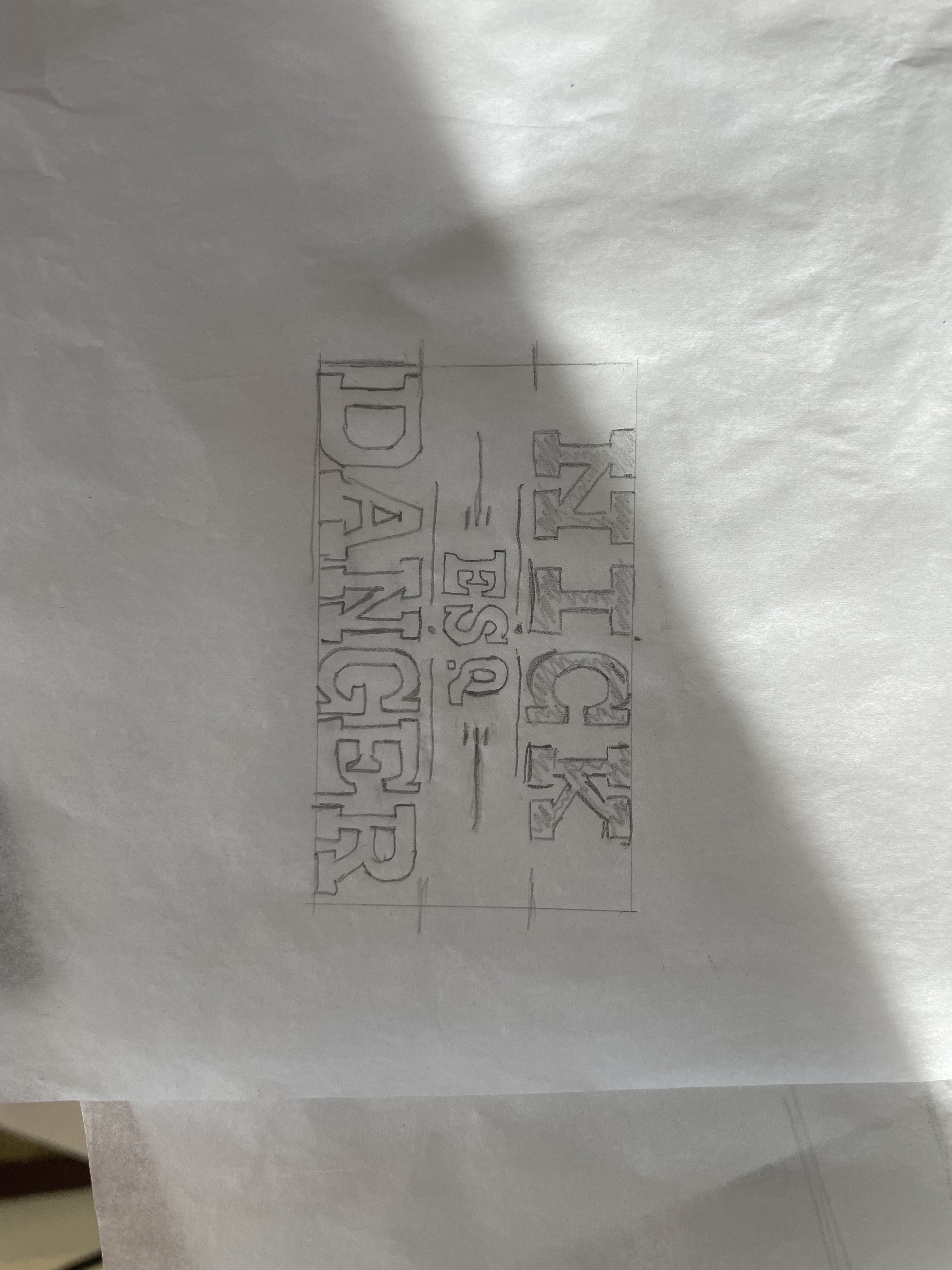
The project scope was to creat a business card print for a sort of indiana jones type character. I started by tracing out a business card onto a sheet of paper, marking out the margins, and then iterating on the design.
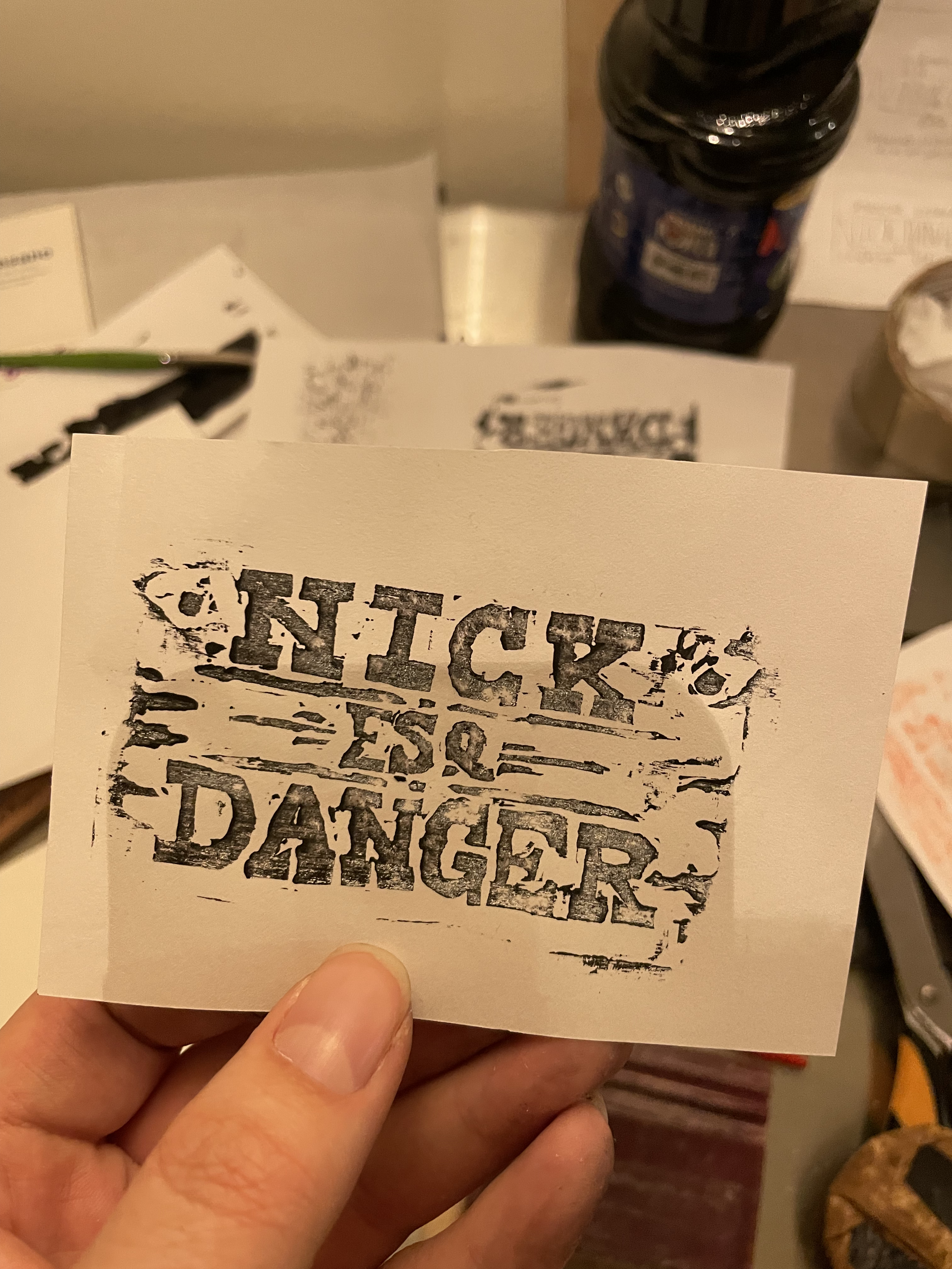
I liked the idea of using a heavy western font that really dominated the space so I went with that design and drafted the letters as evenly as I could with my limited experience. I then needed to fill the interior space and experimented with a couple ideas. After some carving tests I realized I wouldn’t be able to handle the small details of fine text and stuck with a simple “ESQ.”
In order to fix alignment, I traced my winning draft onto a new piece of paper, offsetting it slightly as I went in order to bring everything into place.
I spent quite a while drafting out different takes on the little “ESQ” title. I needed it to be squat enough to not butt up against the top or bottom text while still being legible and carvable. I originally wanted to do a sans serif monoline font with an oval outline. I ended up scrapping that idea because the fine carving required between the oval and the letters seemed too risky and time consuming since I didn’t want to have to start over and didn’t want the project to stretch out more than the time I’d budgeted. From a design perspective I also wanted to lend more weight to “NICK DANGER” and putting “ESQ” in an oval meant that it became dark and detailed and pulled too much attention. It also left too much negative space on either side. I added back some slight serif to the letters because without them it didn’t seem to fit the retro style quite as well.
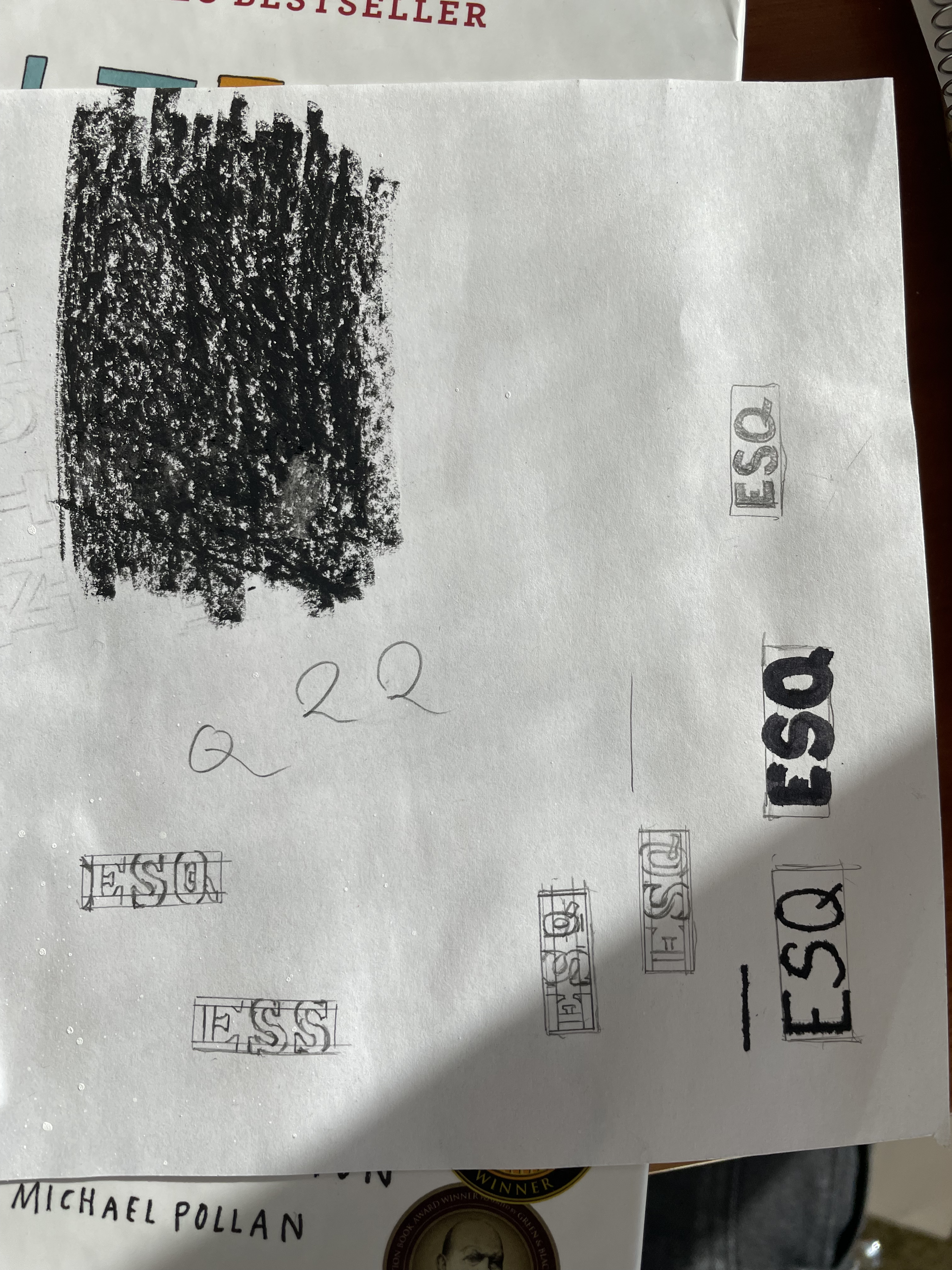
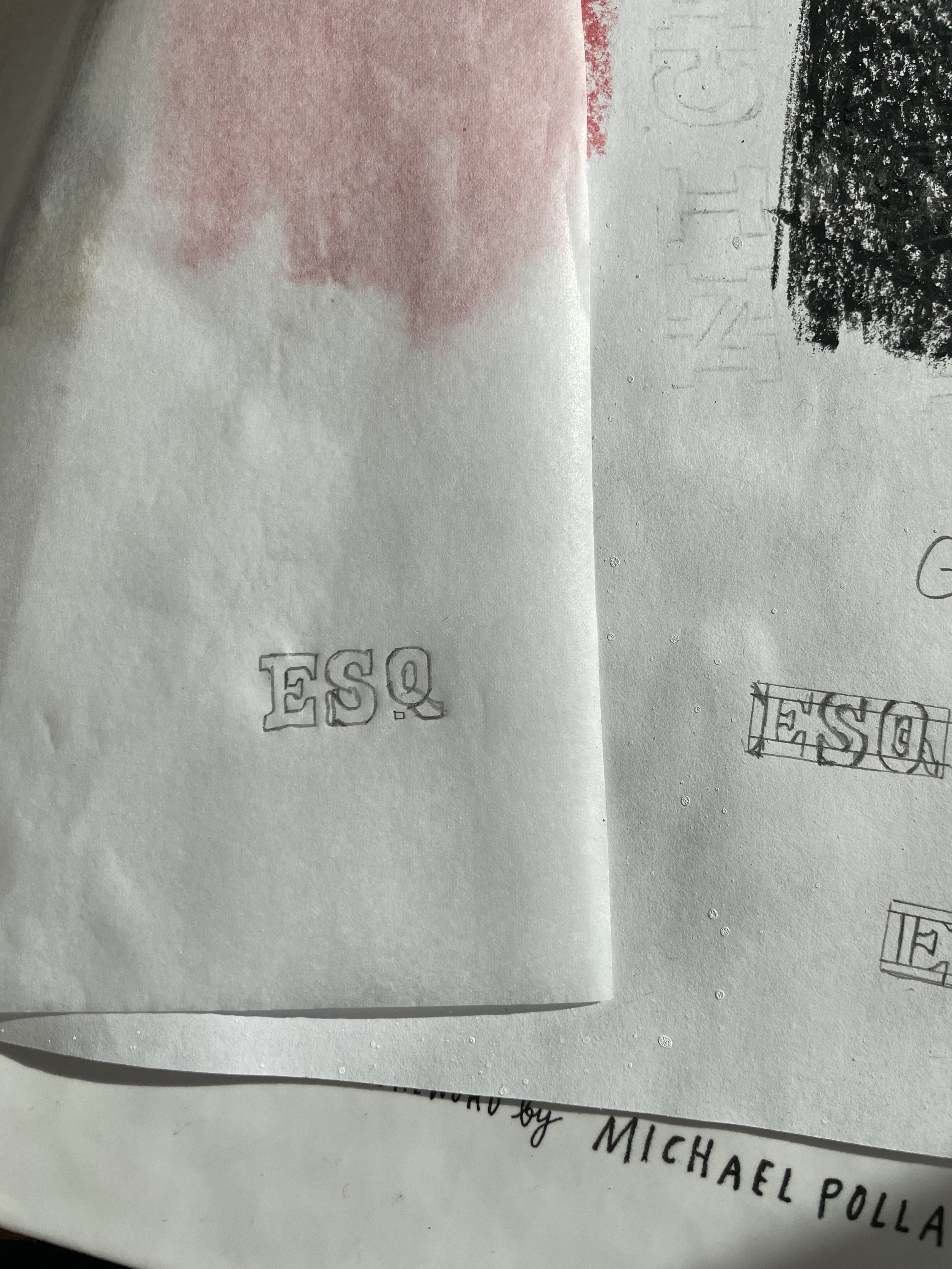
I then traced out a little block for the space ESQ would take and iterated a bunch of times. I really struggled with finding a “Q” that was legible and fit in the space, ultimately I don’t think I quite succeeded, in retrospect I think extending the beginning of the tail past the left edge of the round part could have helped legibility. While the letters fit stylistically, looking at the finished prints I think they still take too much visual weight and aren’t clearly distinct enough from “NICK DANGER” I would say that it should have been smaller, except given this was my first time using these tools I was already working at the edge of my abilities without risking needing to start over. perhaps thinner line weights or making the name white on black instead could have helped.
In order to add more black around the letters I added in the border stripes above and below. I also began experimenting with different decorations to take up the negative space in the middle and around “NICK”. I used another sheet of tracing paper to overlay these designs and swap them around. Eventually I settled on some lines and interpuncts.
The Carving Process
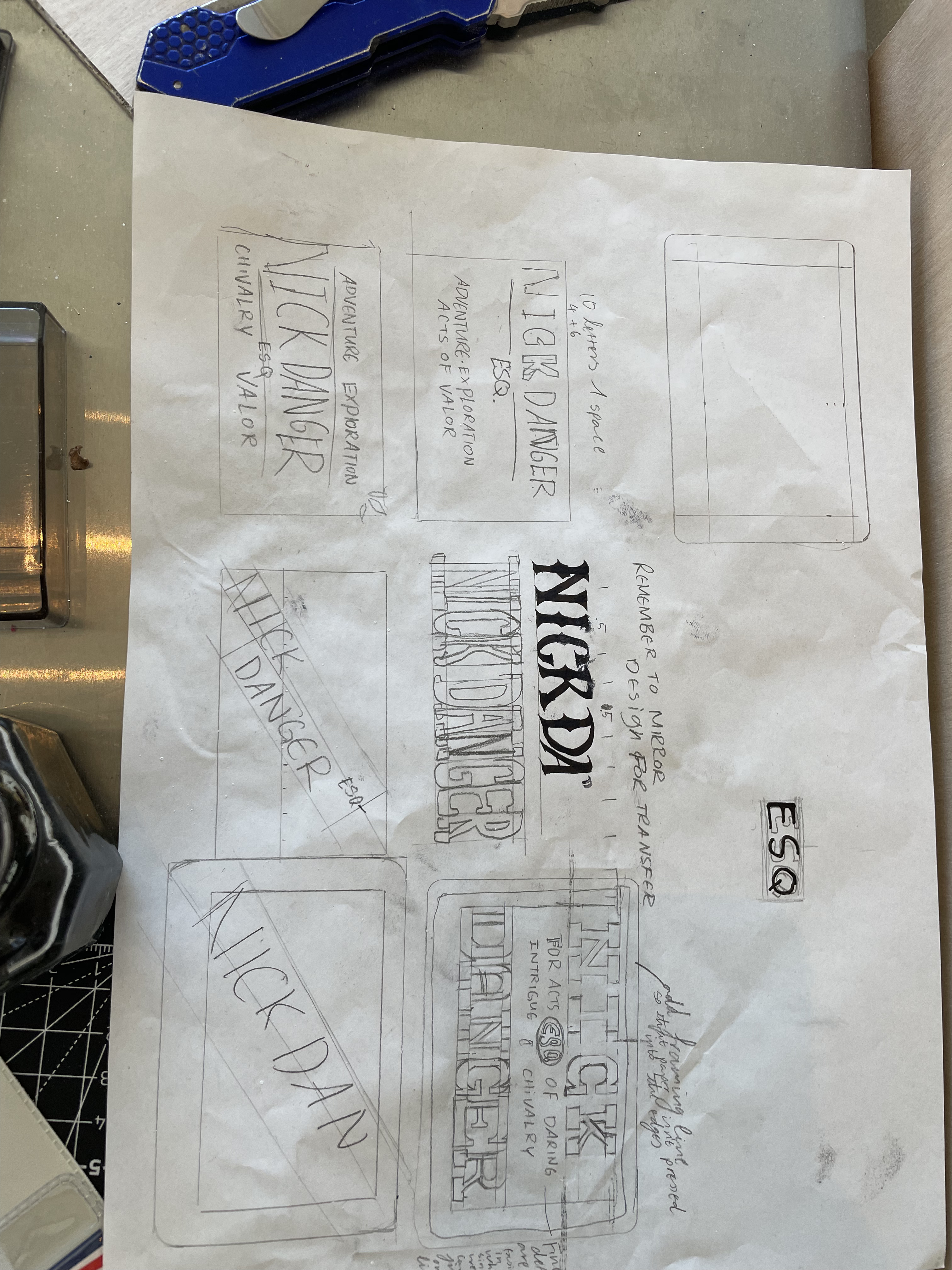
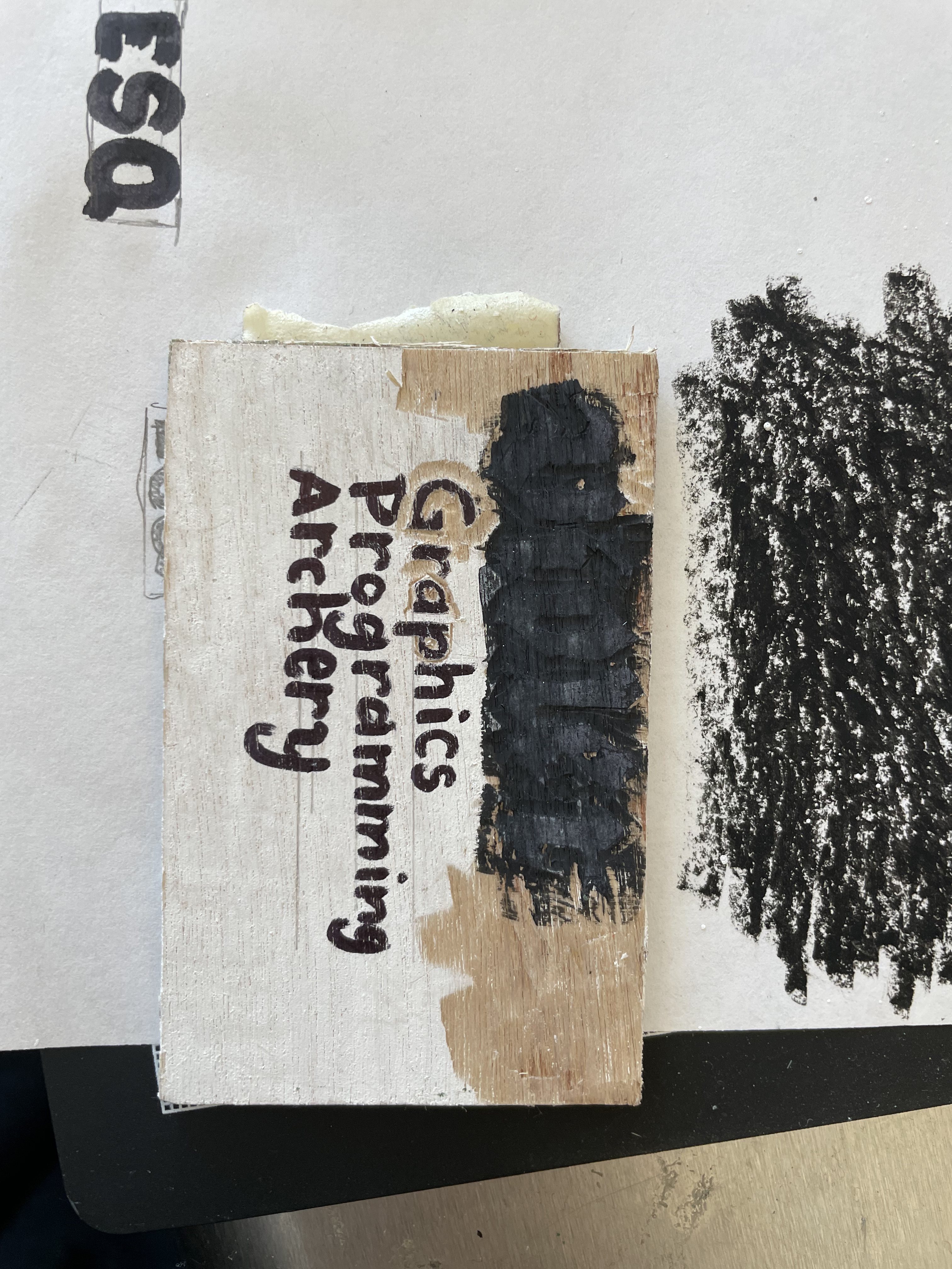 The above is a test piece I did in a small piece of doorskin plywood with a design drawn directly onto the surface of the wood. From here I realized that I had forgotten about mirroring the design for block printing. I also discovered exactly how difficult smaller text was to carve.
While talking about the project someone with woodburning experience suggested using basswood instead, I got a small 1/8“ piece on my way home and it carved much easier so I used that for the final version.
I painted the wood surface white, and then used a stylus to transfer the graphite from my tracing paper to the wood.
![]()
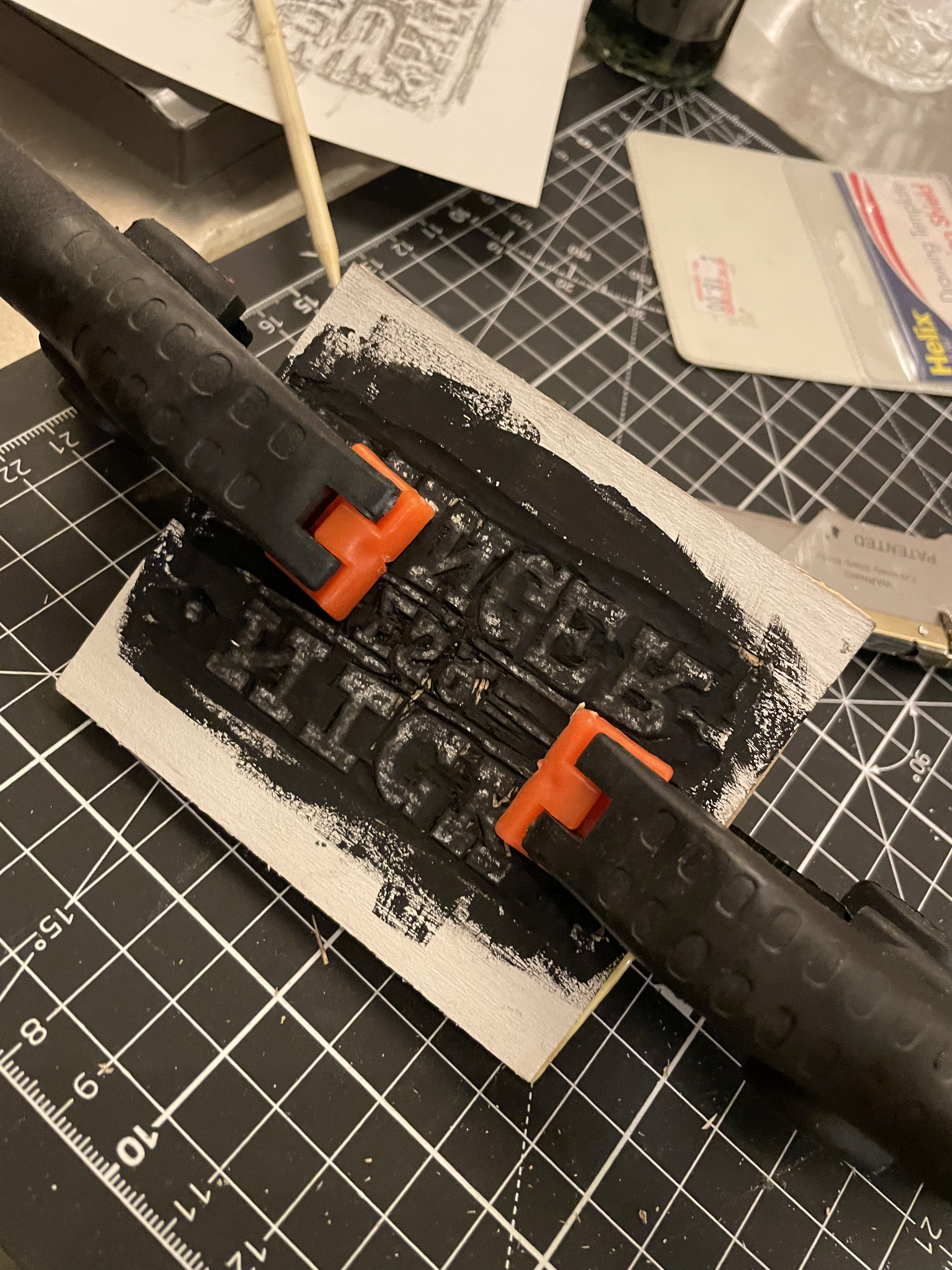
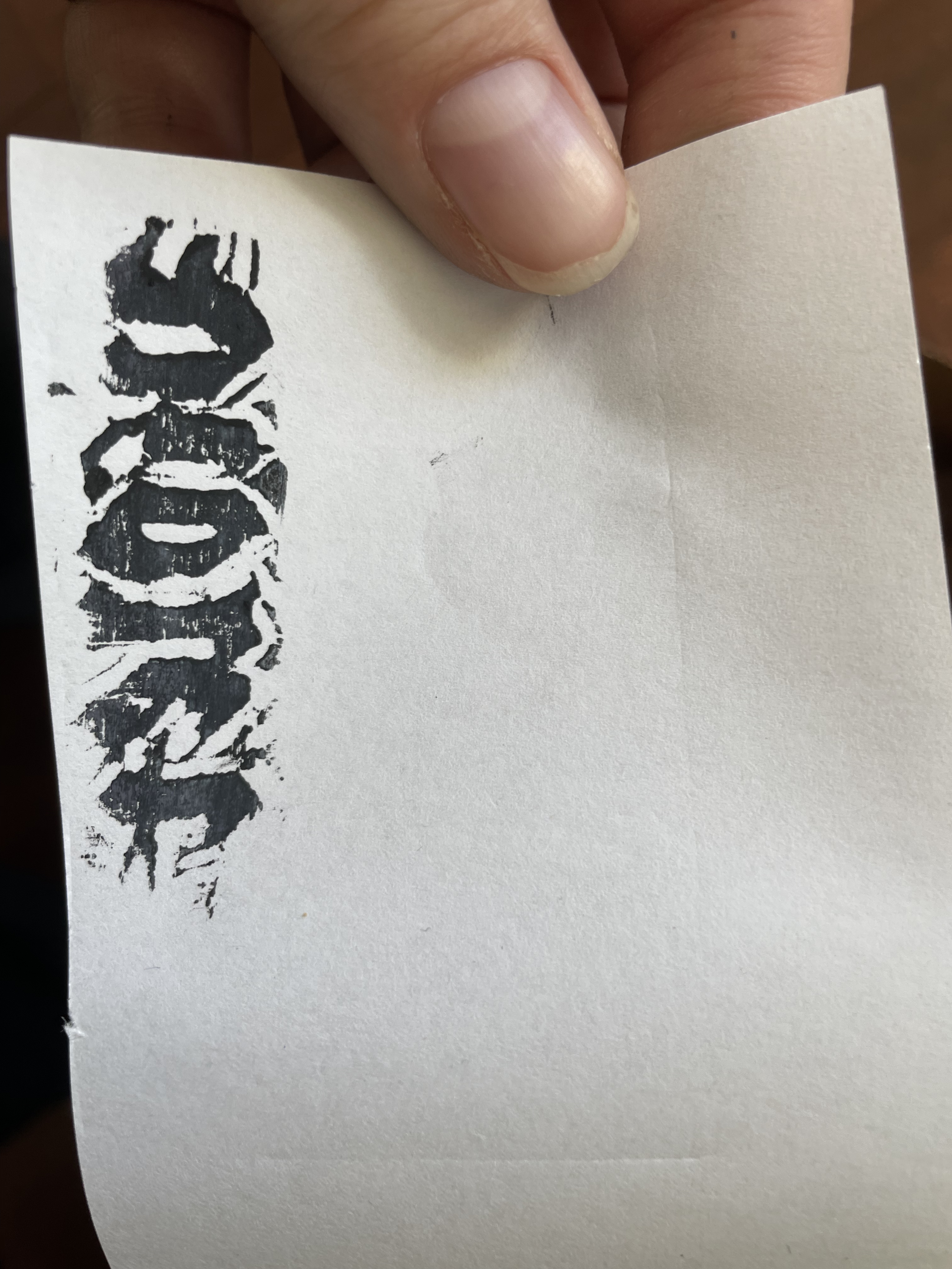
I used double sided tape to hold the workpiece down and started my carving by scoring around each of the letters as a guide and then wherever possible using a flat chisel up to the score line. I also made ample use of a wide U-gouge and an angle gouge for tight spaces.
I’ve since learned that the tradition is primarily to ship carve around linework and obly use gouges for bulk removal or texturing.
The last step was to glue the basswood onto a plywood backing since on its own a thin sheet of basswood is not stable and would warp from the moisture of the printing ink.